
12 years of work
While I was trying to be concise in this article, it became clear that there’s a lot to talk about when it came up to all the developments made. I’ve worked on all the main products, like the website and the apps. There was a study, a lot of learning of best practices, new methodologies, trial and error, A/B testing, and most of all, iteration on the main product.
One of the big advantages of designing, leading, and developing in a startup is that you have a lot more freedom to try, fail, do it better, and improve on what you build. In a real agile way. But instead of dealing with just a small part of a product, as you would in a big company, you get to touch many different areas and learn from them. You also need to develop new working methods as the company grows.
Cooperation and communication are keys.
To comply with my non-disclosure agreement, I have omitted and obfuscated confidential information in this case study. All information in this case study is my own and does not necessarily reflect the views of KuantoKusta.
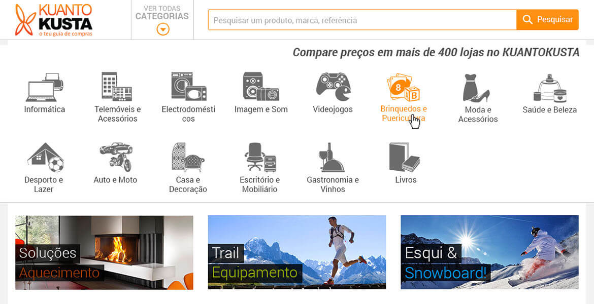
How I helped KuantoKusta’s site grow from 10.000 visits a day to +300.000
KuantoKusta was born in 2005 and is Portugal’s first price comparison site.
When I joined the team back in 2009, there was no designer. I’ve joined as a content manager, meaning I manually create and match the products from the various stores available on the site.
Back then, the site was static, made with HTML tables, with a design rather common at that time.
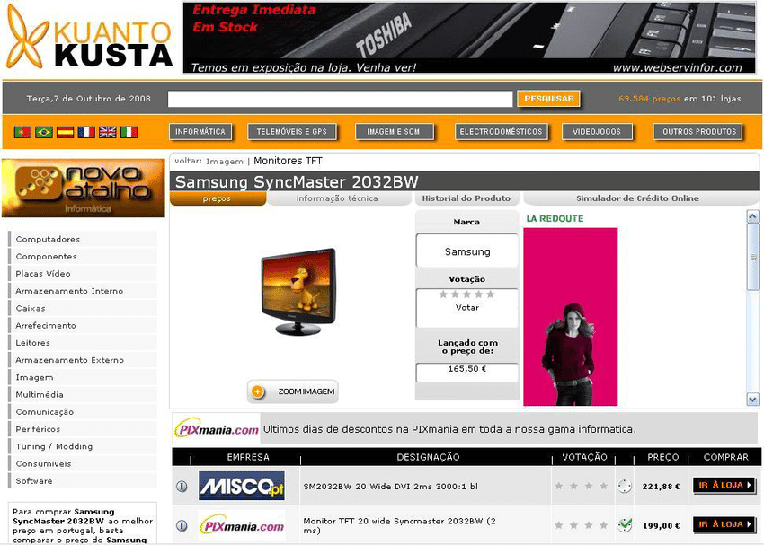
In 2013 a new site was designed by another designer, one that was still static (not responsive). It featured a clean and pleasant look, leaving behind many of the web 2.0 ascetics while trying to address some of the old site’s issues.
We’ve measured the implementation success using various sources of data for analytics.
One that’s proved quite useful was the click heatmap:
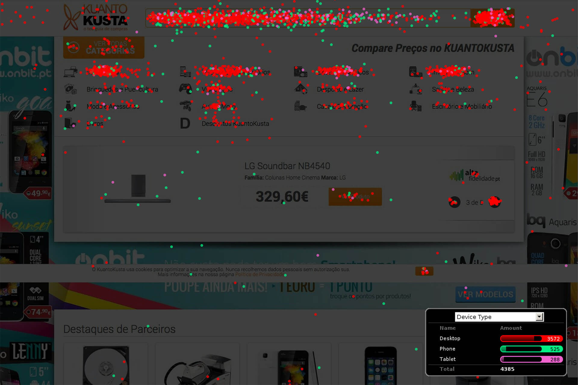
This showed us where the users clicked if they were new or returning users. Which areas were they ignoring?
It allowed us to understand that the implementation of the menu wasn’t capturing the user’s attention and occupied an important space in a premium position, and we also improved the way category icons were displayed. So we’ve improved upon that to a version that remained the same for some months:


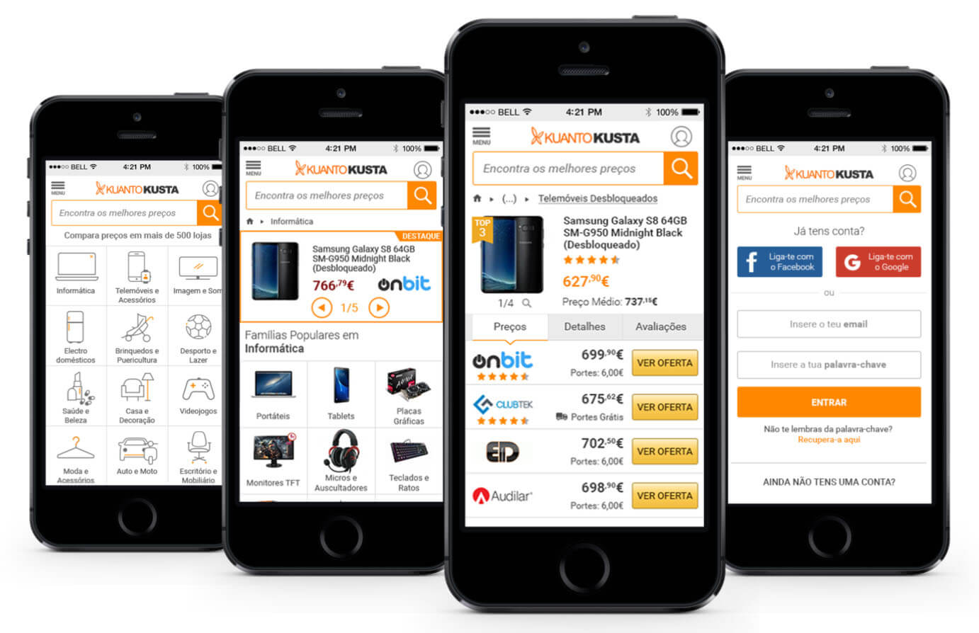
The responsive website
Then in 2014, we built a responsive website based on the bootstrap framework, which was a huge challenge.
In 2014 there weren’t price comparison sites on mobile yet, so there wasn’t much inspiration, best practices, or tried and tested solutions.
Smartphone usage rose, representing a small fraction of global visits (less than 15%). So designing a mobile site wasn’t seen as mandatory.
The main challenges we’ve faced were:
- No point of reference from similar sites doing the same. Current solutions used an m.site that we discarded as a solution.
- The experience on mobile needed to be a good and optimized one, meaning there are a lot of technical workarounds and content that need to be hidden.
- We wanted to use the default systems fonts, but they were different on each platform (Arial on PC, Roboto on Android, Helvetica on Mac, and so on)
- We need to maintain the appearance of the desktop version as much as possible not to compromise the conversion rate already acquired. So instead of making a mobile-first approach, we need to work the other way around.
- No user testing.
- Limit time and resources. Only 2 developers have done this from scratch.
- We needed to choose a CSS framework to help us with the task at hand, but none seemed to meet the requirements we needed for the layouts we already had.
- We made it an objective to stay under the 3 seconds of page load time on mobile.
We used a modified bootstrap version to meet the requirements, with 15 columns instead of the default 12. It made sense because of the layout that already existed in the desktop version. We have multiple site areas with 5 or 3 columns, and only a few widgets occupy 2 columns. So if you want to make something static responsive, you need to work with what you have. Now it is highly outdated, and it’s being replaced by modern technologies that are more suitable for the task.
I was working both with the content team, being one of them, and still creating and matching products. At the same time, I was designing new tools to make the work more efficient while upgrading now and then the site with new functionalities
In 2017 we launched the windows phone app, followed by the first versions of the Android and iOS apps. I designed those, and I’ve to keep updating them regularly.

Because we had other big projects running (like KuantoKusta Supermercados in 2016) and the design team didn’t grow (one additional designer was added, but at that time, we were still 2), and the lack of developers meant that the apps couldn’t be developed as they should have.

The Marketplace
In 2018 we changed the site and developed a marketplace from scratch.
All the development and design were made in-house.
This meant building all the supporting systems to work, including the cart, checkout process, email automation, back-office areas, and of course, the front end.
My role was senior designer, product owner, information architect, and gluing everything up in our team of 23 people (the whole company).
We had about 6 months to get it done. From scratch to deploy.
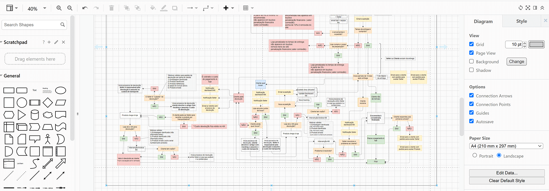
The main challenge was implementing multiple checkout carts, where different stores could sell different products in the same basket. For the end-user, the message was that he was buying in KuantoKusta, from which store it didn’t matter.
I’ve created the order flow with diagrams and specifications, incorporating the various scenarios that could happen and the related SLA (Service Level Agreement). That helped develop all the engines that would support the marketplace.
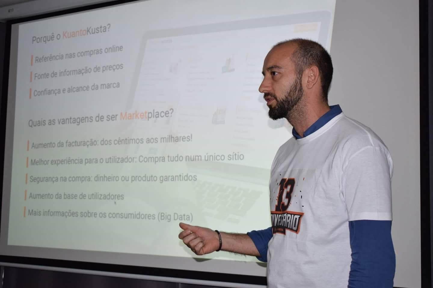
Then we needed to address the issue of listing all the stores on the product page with different business models: we had stores in pay-per-click, and we had stores that only paid a commission fee for the orders. The two business models conflict since the pay-per-click stores often present lower prices than the others.
So in 6 months, we designed tasks that involved UI/UX and communication:
- The brand new login for the site, we didn’t have one since it wasn’t needed till then.
- The checkout process and shopping cart combined multiple sellers and products (a combination of around 700 stores and 1.8 million products).
- The back-office admin areas for sellers to manage the orders.
- The creation of all the communication for supporting changing the business model: social media posts, PDF / Powerpoint presentations, Banners, internal merchandise, etc.
We had one shot at getting it right as an MVP for all of those developments. We’ve succeeded partially, and kudos to the tech team that made it possible. You guys know who you are!

Because we were a small team, we didn’t have the time or the experience to conduct user research in the beginning stages of the process, nor in the later stages, for that matter. We’ve relied heavily on expertise in-house and didn’t challenge our assumptions. That would prove to be catastrophic in the short term, not because the usability had issues (it did, a lot of them) but because we’ve changed the way we present information to users. More about this is in the following.
It was time for a change
In 2019 we realized that this business model wasn’t working, so I devised a new one. You can read the story behind it here. This involved a lot of work. Changing the business model impacted all areas of the company, and we need the buy-in from the team to make it work.
Fortunately, we had a great team, and everyone worked to complete it. Results were visible in only 2 months, which helped the team feel and confirm that this was the right path. In 6 months, we were back to position ourselves as a reference for e-commerce in Portugal, with contenders like Amazon, Aliexpress, Worten, or FNAC. Overall the team had just about 70 employees.
That was a big challenge, but quite an enjoyable one, some team members from all departments got together and made it work to bring huge profits to the company.
We have rebuilt the functionalities with more issues like the shopping cart and the checkout processes, and we’ve had great results above the industry in terms of conversion rates.
The mobile challenge
Almost everyone has a computer and a screen right in their pocket, and it’s used to do everything, including shopping. So it is no surprise that we need to invest a lot of work to improve the mobile experience. That included better UI, better UX, and lower page load times.
I dive deep into the mobile site and apps in this post.
We’ve done all sorts of A/B testing using Google Optimize that helped improve the conversion rates.
In 2020 and 2021, the company was featured in dozens of news, with more prominence on TV, and it is seen as a lighthouse to prices and shopping in Portugal.
We’ve been awarded the “Escolha do Consumidor” (consumers’ choice/recommendation) in 2020, the second year in a row.
Managing the Content Team and the Design team
From 2009 onwards to 2019, I was the team leader of the content team and the design team.
In total, 20 people worked with me on both teams.
Besides managing these 2 teams, I worked as the extra designer, being responsible for the website, the apps, and the back offices (there are some).
The design team has had 3 designers, including myself, since 2018.
In 2020 I continued as Head of Design and team leader of the design team after training and developing a new team leader for the content team.
Only in 2021 did it expands to have more than 3 designers. We were 6 in 2021.