
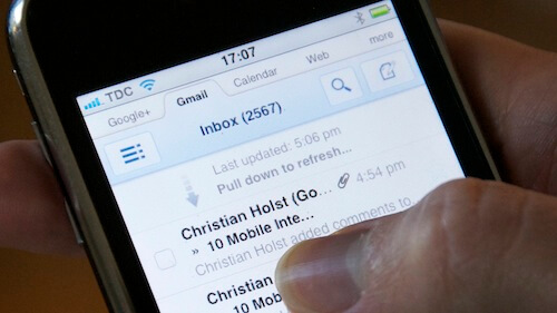
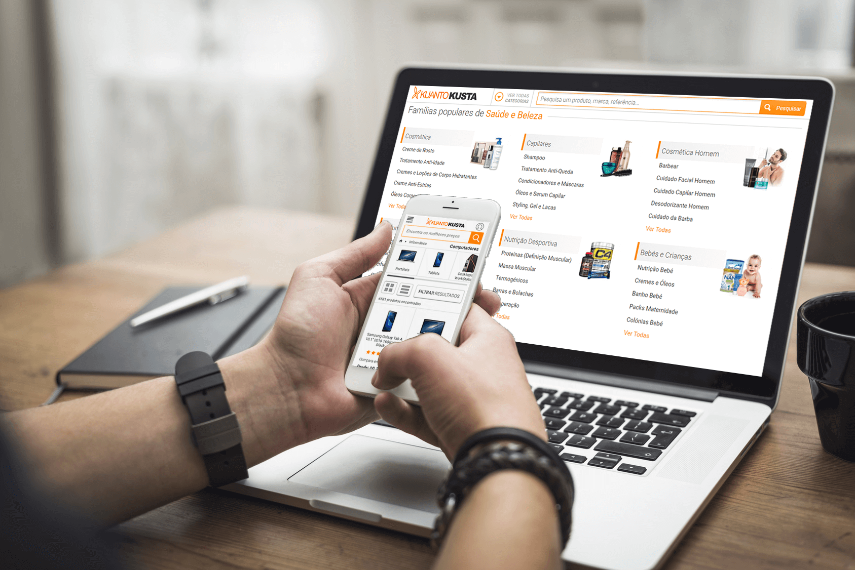
KuantoKusta is the number one price comparison site in Portugal. Since its foundation in 2005, the site has aimed to help users find the best price for a given product in all the available stores. Until 2010, most internet users accessed the web via notebook or desktop. But the revolution was already on its way since the launch of the new iPhone in 2007. Internet and apps would never be the same. It was mandatory to give the users an easy way to access the same information on their phones that they had on the desktop. This is the process of converting a website into a responsive one and the related apps and is evolving. You can check the apps live from: https://www.kuantokusta.pt/public/mobile, available on Apple Store, Google Play, and Huawei Store.
To comply with my non-disclosure agreement, I have omitted and obfuscated confidential information in this case study. All information in this case study is my own and does not necessarily reflect the views of KuantoKusta.
The year is 2014, and we are deciding how we will technically build the responsive website.
Empathize
We need to learn everything about the responsive web, its technical limitations, and how the users might use the site.
- How will a user access and use the site on their phone
- What are the technical limitations of the existing platforms
- What we should avoid at all costs
- We did a competitor analysis and benchmark
- We use web analytics with all the data that we have available from our current users
Back in the day, our main concern was offering users a fairly decent experience. We had 3 developers available to pull it off. But we had a lot of will and ambition to learn and experiment.
Our national competition was gone, and other similar sites worldwide didn’t embrace the mobile experience yet. So we turn to e-commerce sites to make a comparative analysis.
Smartphone screens are considerably small, so you easily lose the context of your page, making it harder to compare various options and view content.
Because the space available wasn’t much, it was also hard to use a keyboard to make simple inputs, like using search, and quite error-prone.
Defining the problem
At that time, there were some serious limitations to making a good mobile website. On the one hand, you didn’t want to go with an m.* site since it was a different domain than your main site. You’ll want to provide the same information, but you didn’t have the space.
More advanced solutions were still boiling, so we needed to rely heavily on responsiveness to make it work. On top of that, there were issues concerning the poor connectivity in big areas, the site needed to be light to be fast because you didn’t have a big bandwidth and smartphone hardware was in its infancy.
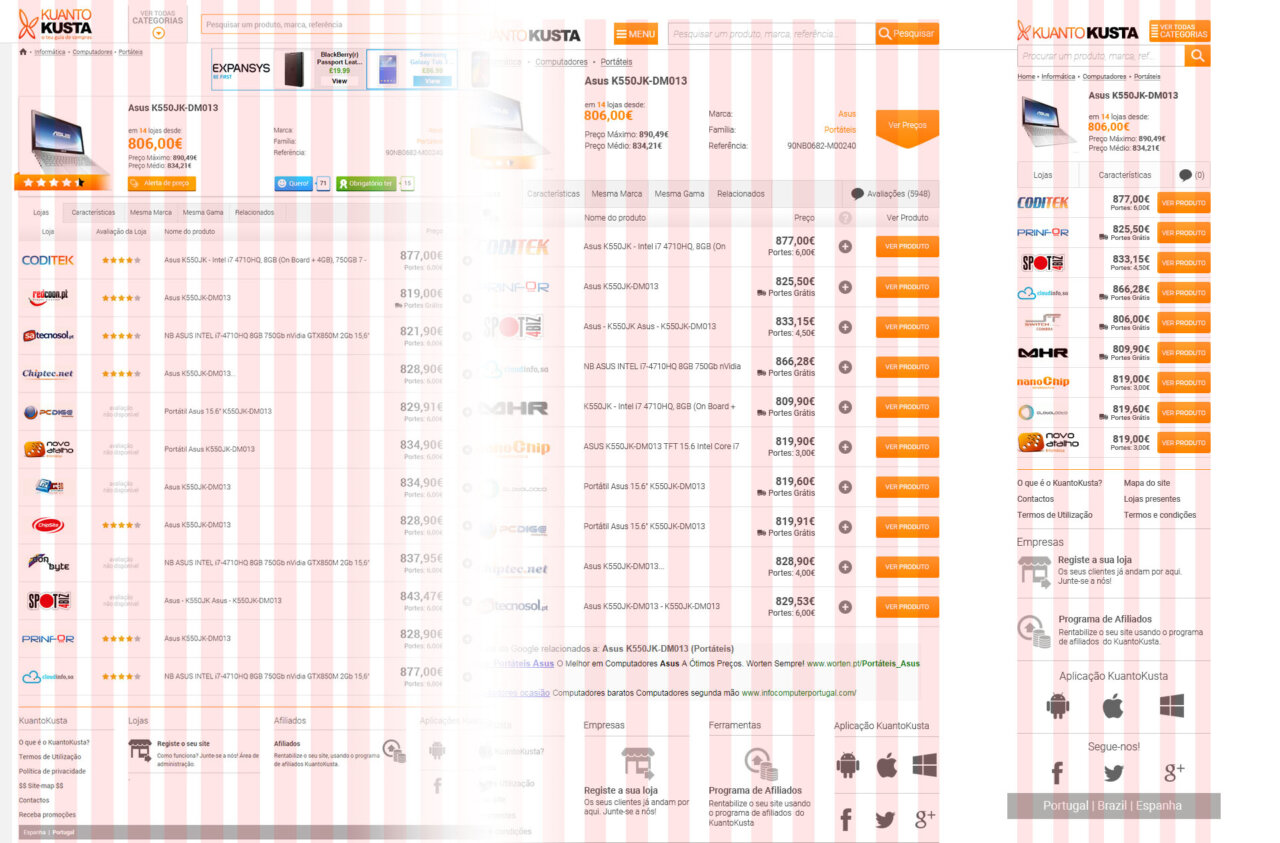
We ended up picking the CSS bootstrap framework, customized to our needs. That first site helped us gather a lot of data and provided the ground zero for future innovations.
The first version of the responsive site offered a good enough experience:
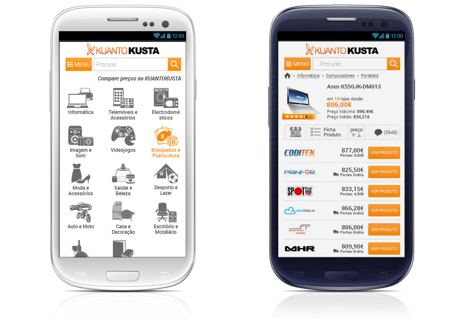
Defining the correct problems helps us develop the website in an agile way. This stage was about solving the technical issue while providing the best experience possible. Because we were still at the beginning of a great journey, which allowed us to experiment much more.
We built the product and shipped it even if it was not “perfect”, or at least it didn’t check all the marks. But the data collected from the usage was enough to work on the right things and improve those faulty areas.
The main concern was providing the user with a tool he could now use on the move. That was a paradigm shift.
We use heatmaps and click maps together with analytics to inform the issues that need to be fixed. At the time, we also developed a Windows Phone App and Android and iOS Apps. The usage of the apps and the data gathered from there also help us make more informed decisions.
The apps and sites were changed and grew together, influencing each other. We’ve done countless A/B testing on the mobile site: colors, positioning, hidden and showing things, and improving legibility, among others.
There were a lot of decisions made concerning the site based on that analysis. In this stage, we started to progress to the third stage, Ideate, by asking questions that help us look for ideas for solutions by asking: “How might we…”
Ideate
Based on the information that we collected, we create some “How might we” questions that will guide us through brainstorming, prototypes, and future developments:
- How might we create a mobile site based on the working desktop version without affecting the conversion rate negatively?
- How might we work around our technical limitations and still offer a good experience?
- How might we use system fonts, saving huge load times, when they differ in all the more common platforms?
- How might we deliver a good experience if there’s no user testing involved?
- How might we use an existing CSS framework without losing the site identity?
- How might we save and optimize the resources to deliver a fast and reliable site?
- How might we offer a decent mobile experience for users already used to the desktop version?
- How might we measure the success/failure of our solutions?
- How might we address the highly generic and different content and present it in the best way possible?
Since I’ve worked in the content team responsible for creating and matching products on the site, I had a holistic view of the content I needed to work with on the design. I also knew how many categories we have, their content, how many stores existed on average for each product, and what kind of information and characteristics were available to work.
It’s an advantage of working in a start-up. You get to touch many different areas, I also made the advertising, so I had some marketing knowledge. My side hustles allowed me to know the intricacies of PHP, HTML, CSS, and Javascript, so I already had a big part of the research done when I started this project.
The prototypes
Most of the prototypes were made in high fidelity since there was no real advantage in creating sketches first.
The main issue was that all elements would be presented as usable and follow the breakpoints determined in the bootstrap. That alone was a big challenge since my time was divided between designing the site, matching and creating products, and leading the content team. Here and there, I also made some advertising work or presentations to be used by the sales team.
This was already a huge step toward the future since most e-commerce sites didn’t offer a mobile solution then. It also became a problem because despite having a mobile-friendly site, we redirected many users to our e-commerce partners, and the overall experience suffered greatly after that. It also set a mobile usage that we were not so fancy of: users will come to our site and compare the prices of something they want on their phones but didn’t click as much on the offers presented. Returning customers knew that if they wanted to buy that product online, they should head to the desktop version instead. Other users were using the mobile site and apps in the physical stores as a tool to know if they were making a good purchase or not. That helped increase the customer base greatly and made that growth steady over the years.
That eventually changed, and it’s common for users to purchase directly on their phones. Hence the necessity of a good checkout process and providing the best possible experience on mobile, be it the website or an app.
Testing solutions
We’ve now got a full working prototype for whenever we need it. From the early beginning, when we used Photoshop for high-fidelity prototyping and a quick pass over Adobes XD, we now use Figma as a prototype platform.
We’ve done some usability testing to understand the user’s pain points and why some features were not used as much as we expected.
Quantitative data alongside A/B testing optimization are used daily.
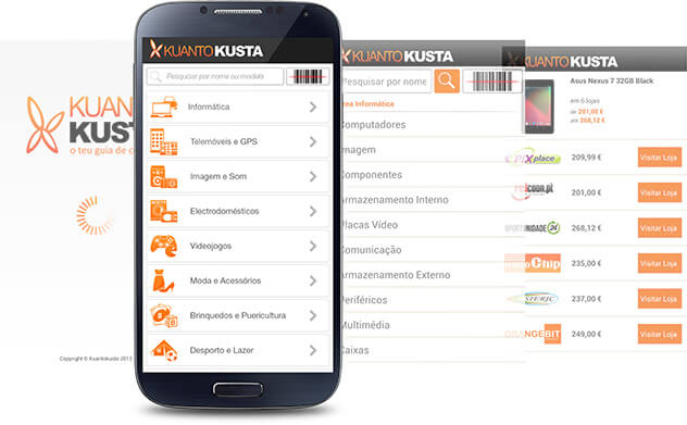
We’ve refactored the whole site to an adaptative one with many advantages over the responsive one. You can have a tailored made solution that doesn’t depend on the component’s position in the desktop version. You can use far less code, which translates directly into a faster and more enjoyable experience.
When we started the refactoring, we made it clear that the layout had to be similar to the first version, so we already have KPIs such as conversion rate, session time, pages per session, bounce rates, and so on. We then proceeded to the iterations and revisited everything that could be upgraded from the first version.

The Takeaway
When you are exploring new ways of doing things, and when you are working in a small team, you often just make an educated guess on what’s best and work your way through there. While in this process, I’ve tried to get as much feedback as possible, but that doesn’t replace proper research. That became quite clear with the multiple iterations of the product.
The longer you work on a product, the easier it is to get the illusion that you know what customers want or how they interact with it. While that is true to some extent that you get to know the users because you are creating new habits and forging an experience, things don’t work like that for new customers.
Quantitative research is useful and can reveal many patterns, problems, and opportunities. Qualitative research, such as usability testing or context inquiries, can uncover a new set of insights that you’ll not get using other kinds of research. The idea is that we use both in our works.