
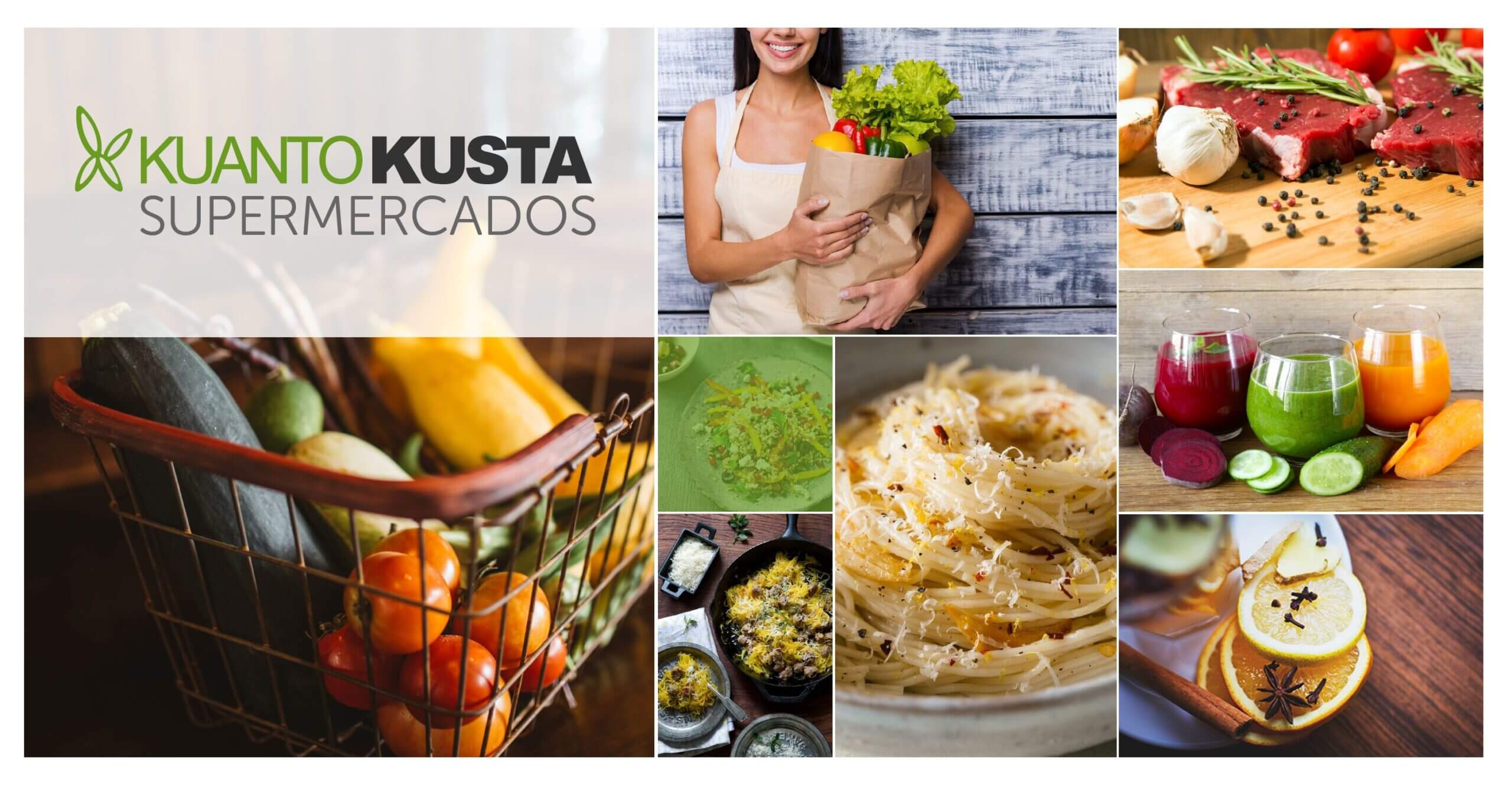
The Project
This project is from 2015 and was deployed live in May 2016. At the time, it was the most advanced supermarket price comparison site in Portugal.
My functions were to design the whole site from scratch, both front-office and back-office. Design the user flow, all the back-office tools, and their functionality for the content team to work on.
To comply with my non-disclosure agreement, I have omitted and obfuscated confidential information in this case study. All information in this case study is my own and does not necessarily reflect the views of KuantoKusta.
Main Goals
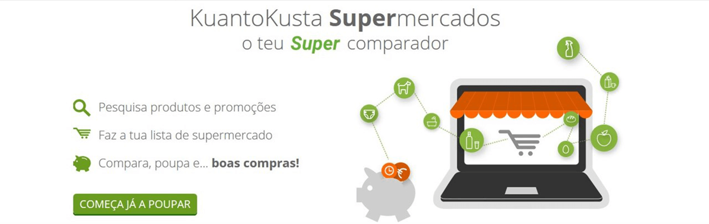
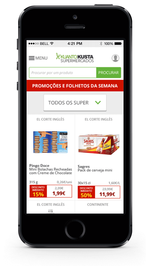
- Compare supermarket baskets from the same geographical area quickly and impartially.
- Identify the best offers and promotions.
- Give the users a free service that helps in the buying decision
- Optimize the way you shop in supermarkets
- Save time and money
Additional Goals
- To be known as the main source to go for supermarket price comparison
- We want to be a daily service that improves life quality for our users.
- Improve the familiarity between users, retailers, and brands on the site.
The challenges
There were some big challenges on this project, namely:
- Inside the same supermarket, chain prices vary for the same product depending on the physical store.
- A huge amount of data was gathered from all the supermarkets available.
- Some products are available at one location and not at another.
- To prevent direct comparison, the supermarket chains don’t sell exactly the same products so you may find in one Coke 1,5L, the rival sells one with 2L, and other rivals may sell the 4x 1L or packs of 50ml cans.
- At the time we developed the site, a lot of the chains didn’t have a website, which alone proved web crawling useless, and we needed to rely on print catalogs for those supermarkets.
- A lot of the promotions were specific to certain locations.
- Supermarkets in Portugal use discount codes, fidelity points, save money to account, etc.
- There was no way of connecting the basket of the site directly to those of the supermarkets.
- Less than 1% of online buyers bought something from online supermarkets (this was before the 2020 pandemic).
- Some products were already present on the leading site KuantoKusta and the stores pay-per-click to advertise them. In KuantoKusta Supermercados, there was no commercial relation to the brands and supermarket chains at the time of online deployment.
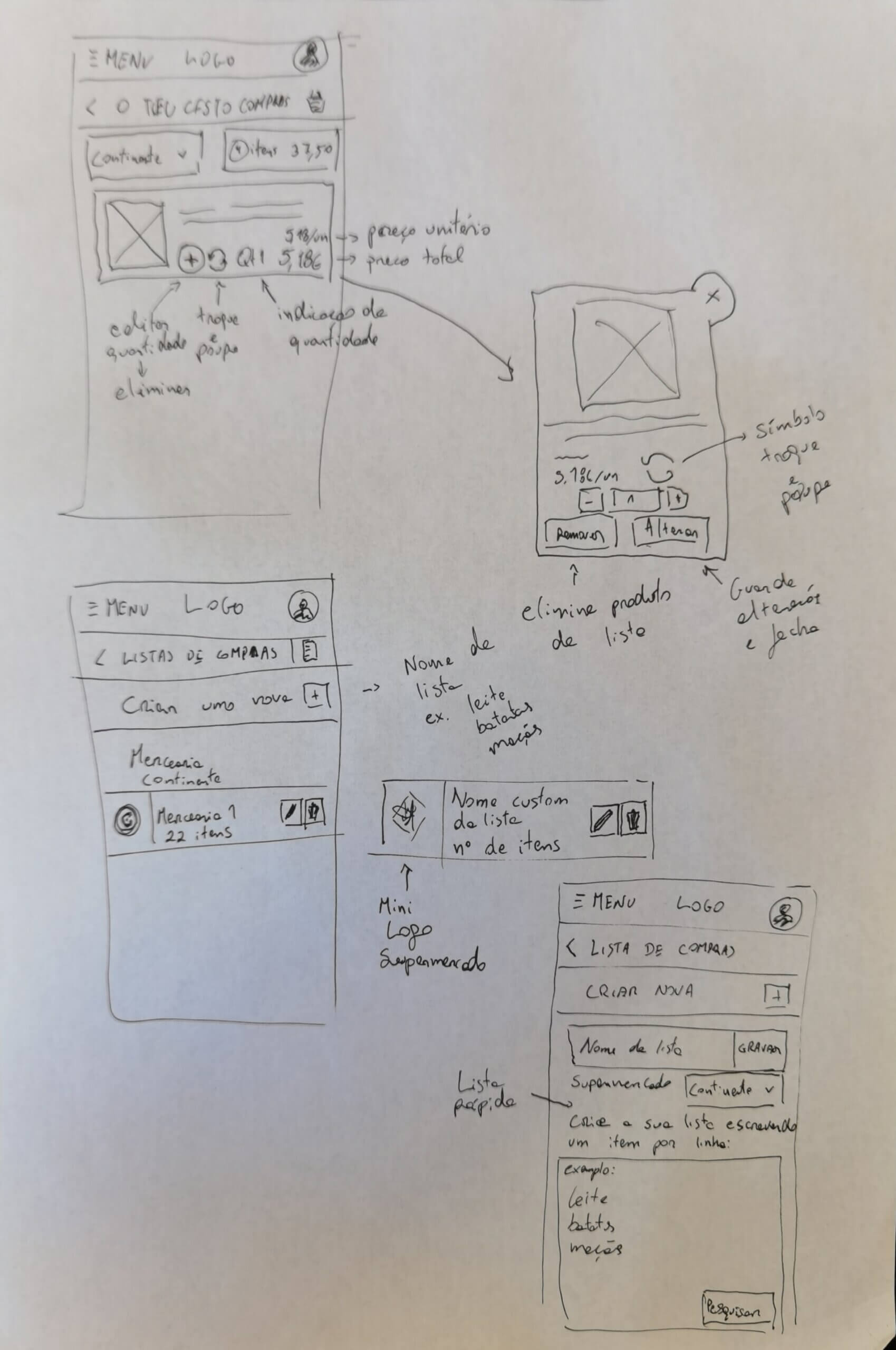
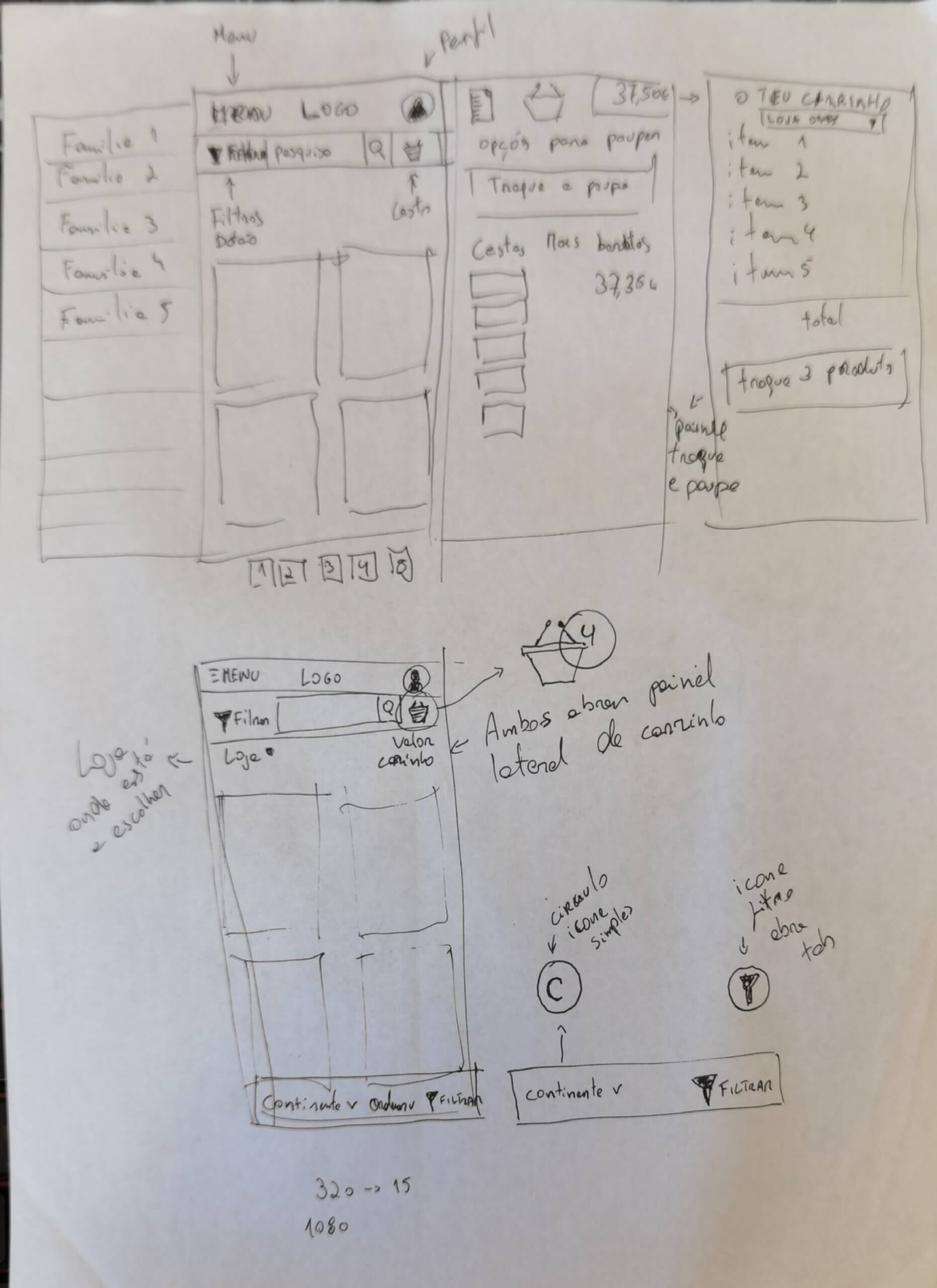
Main features
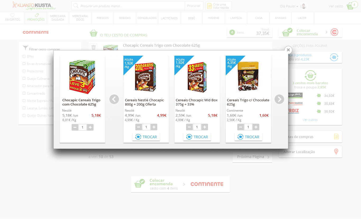
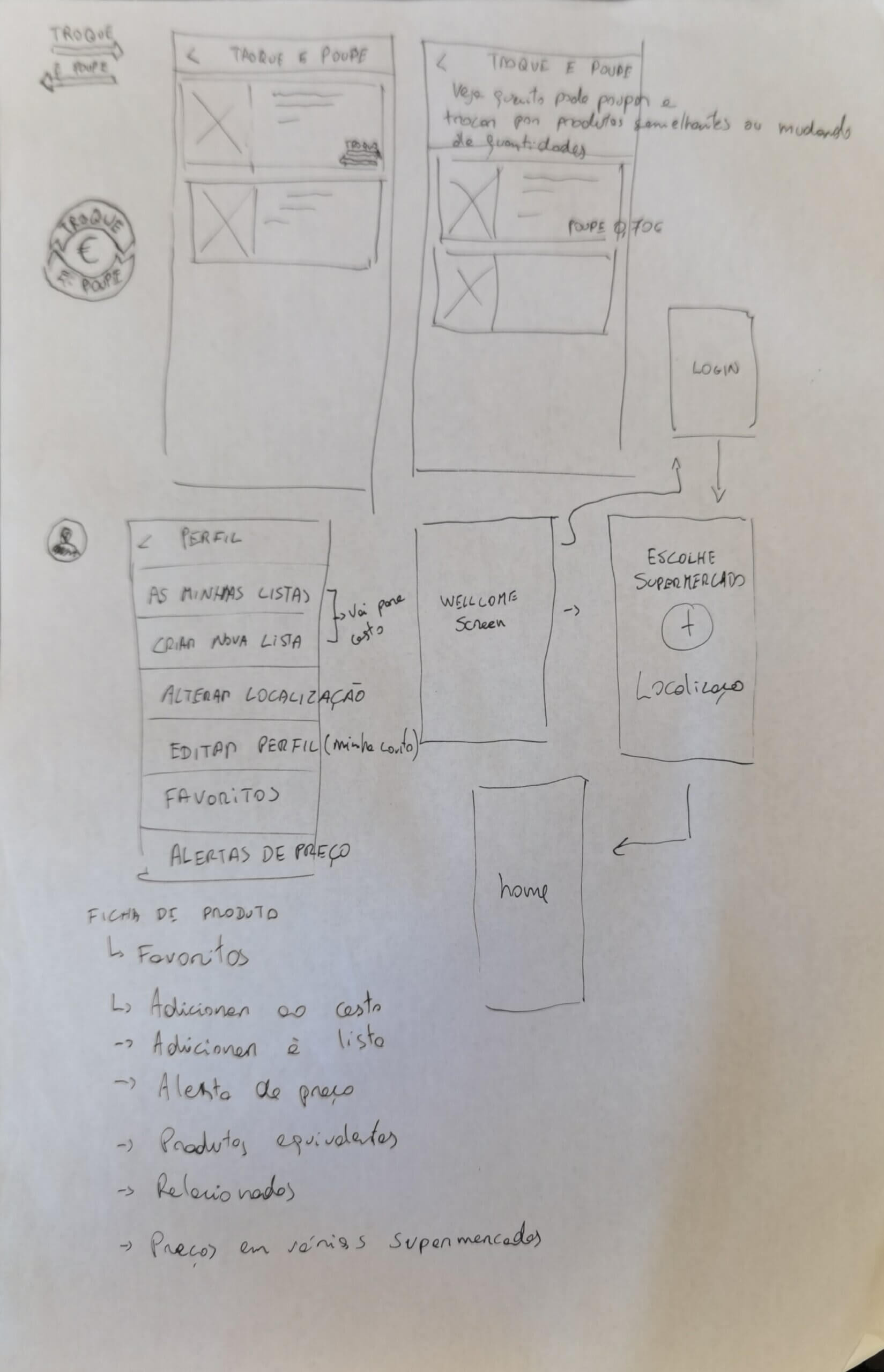
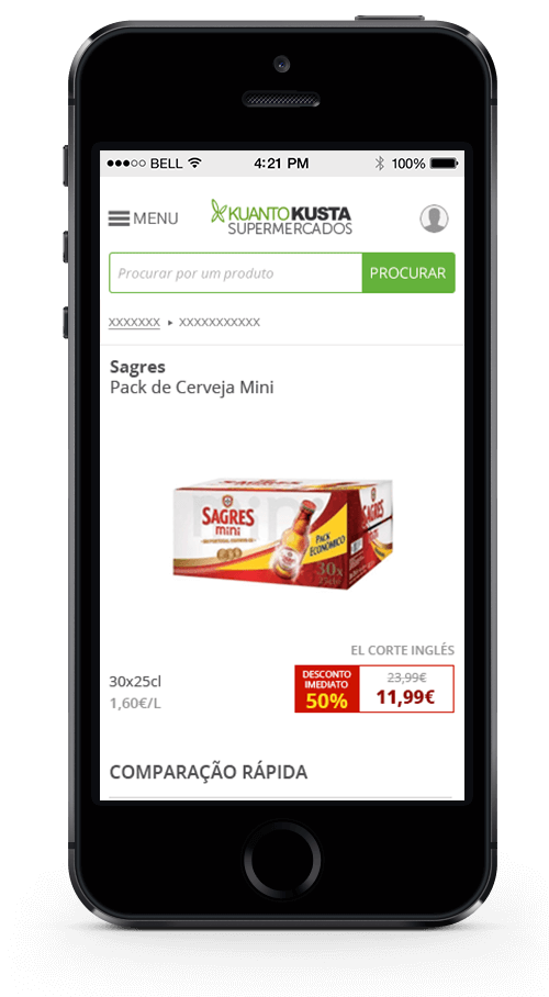
Swap and Save
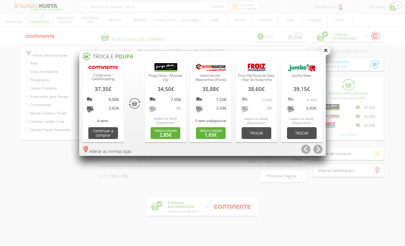
Change Supermarket
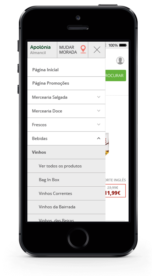
Provide you location
Share your location to find the nearest supermarkets and their prices. Supermarket prices vary from location to location, even if it’s the same supermarket. So we need to ask for the location to show the correct prices for that user.
Swap and Save
Swap your products for similar ones and save money, either because the price per kilogram is lower, or the price per unit is lower, or the price per liter, or there’s an equivalent one cheaper. You choose!
Swap supermarket
The total price of different supermarket baskets was automatically compared so you could choose which one you save.
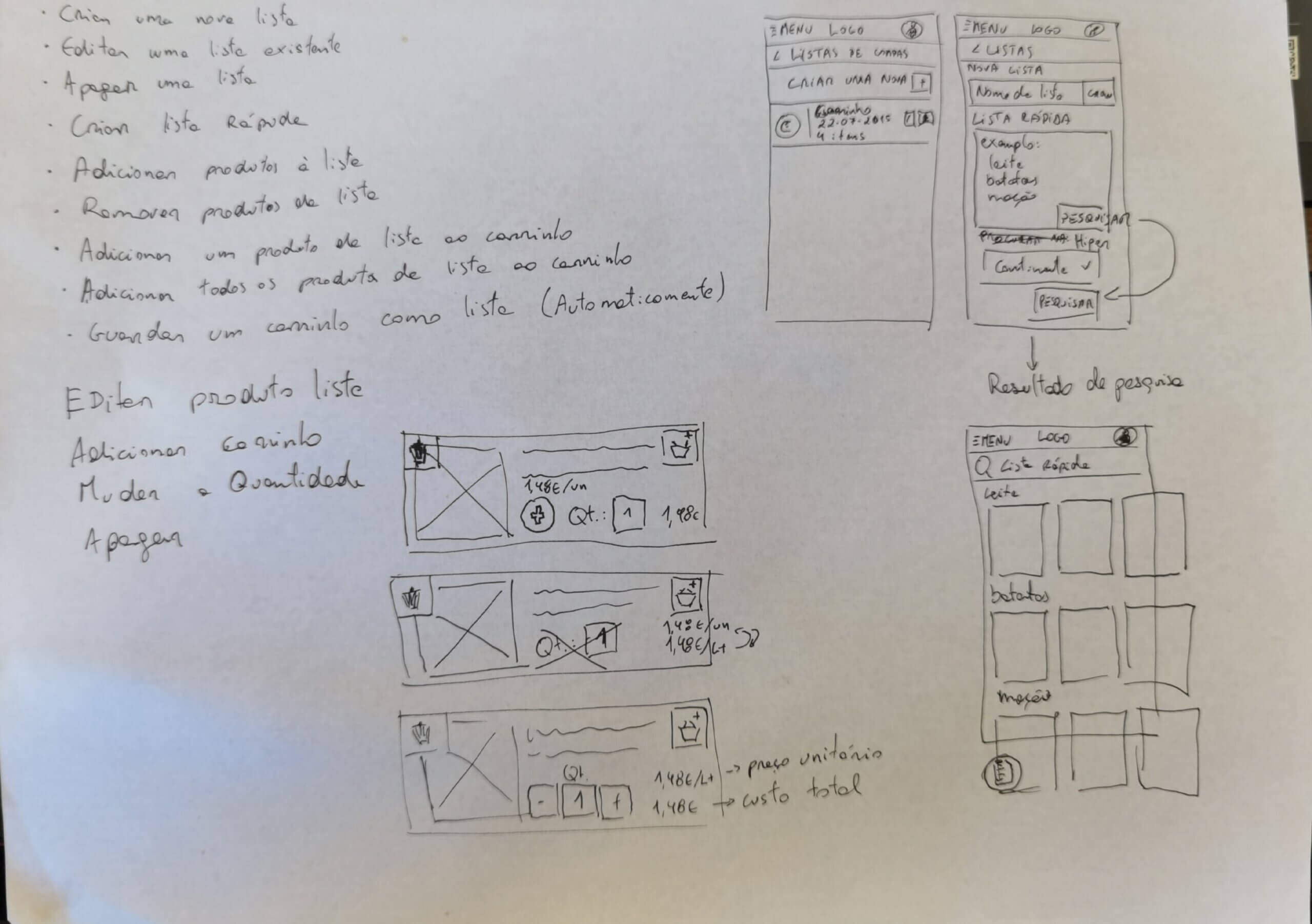
How did it work

- Sign-up and share your location so we can tell you the nearest supermarkets
- Create your grocery list based on suggestions of similar products or cheaper products in the supermarkets around you.
- Compare your grocery list price in different supermarkets near you and choose the one you like most.
- Take your grocery list with you and start saving.
- Further down the road, this was meant to have a direct connection with online baskets or have the chance to use a mobile app while shopping in a physical store.
The mobile site
When we started this project it was with the intention of having a mobile site and an app. It had is how set of challenges but we’re going to approach it in an MVP way, having a first version with the core functionality and working on top of that.
All is well, and we move on to design a high-fidelity prototype, one that we could test with users before development. Unfortunately, it was never developed, and the project was shut down in 2021.
Key lessons learned
The biggest lesson is that we should never try to build the whole thing up front. Instead, we should design and build small, incremental, iterative improvements to help users more. Hopefully, as we release things to users and get feedback, it will become clearer what the next most-needed thing is.
It was clear that the advanced features, while they were great and a big improvement upon the existing comparison market, were also too complex for most users and too complex to manage by the content team. That feature should be tested with a working prototype before it goes live. But time and budget were big to constrain, and there was no time or budget to develop a working prototype of the functionality and test it with the users.
Another important aspect was mobile usage, we probably should have developed an MVP of a functional app since most users already had and used the smartphone massively. Because we centered our attention on the desktop version of the website and after the deployment of the live version, we continued to add more and more features instead of doing all sorts of UX research, we ended up being feature factory oriented by a marketing team that was eager to make it work, somehow… That leads to another very important aspect of designing: marriage with business. Since there was no clear vision of the business model, the design went freely to create yet another great feature, icon, or landing page that, in the end, didn’t improve the product’s user experience.