
Fibonacci and price promotions
We were, at that time, our main competitors, we showed all the prices from a particular product, and we had partnerships deals only with some stores so they could sell in the Marketplace (the other stores were in a PPC model, so they paid for the click if the user visits their site.)
The Challenge:
One day a colleague from marketing approached me and gave me one peculiar challenge.
She wanted a label on the KuantoKusta site to help users find good deals.
To comply with my non-disclosure agreement, I have omitted and obfuscated confidential information in this case study. All information in this case study is my own and does not necessarily reflect the views of KuantoKusta.
We were, at that time, our main competitors, we showed all the prices from a particular product, and we had partnerships deals only with some stores so they could sell in the Marketplace (the other stores were in a PPC model, so they paid for the click if the user visits their site.)
Most of the time, the stores in the Marketplace didn’t have the best price for a given product.
The objective was to help users and increase sales inside the Marketplace.
So at the same time, we were trying to increase sales, but we were showing the users all the prices on a product, and quite commonly, there was a smaller price in a store that wasn’t selling on the Marketplace.
The product page has a top section, a header featuring the product image, the name, some info, and a store, usually in the first position of all the stores. We call it the TopBox or Buybox.
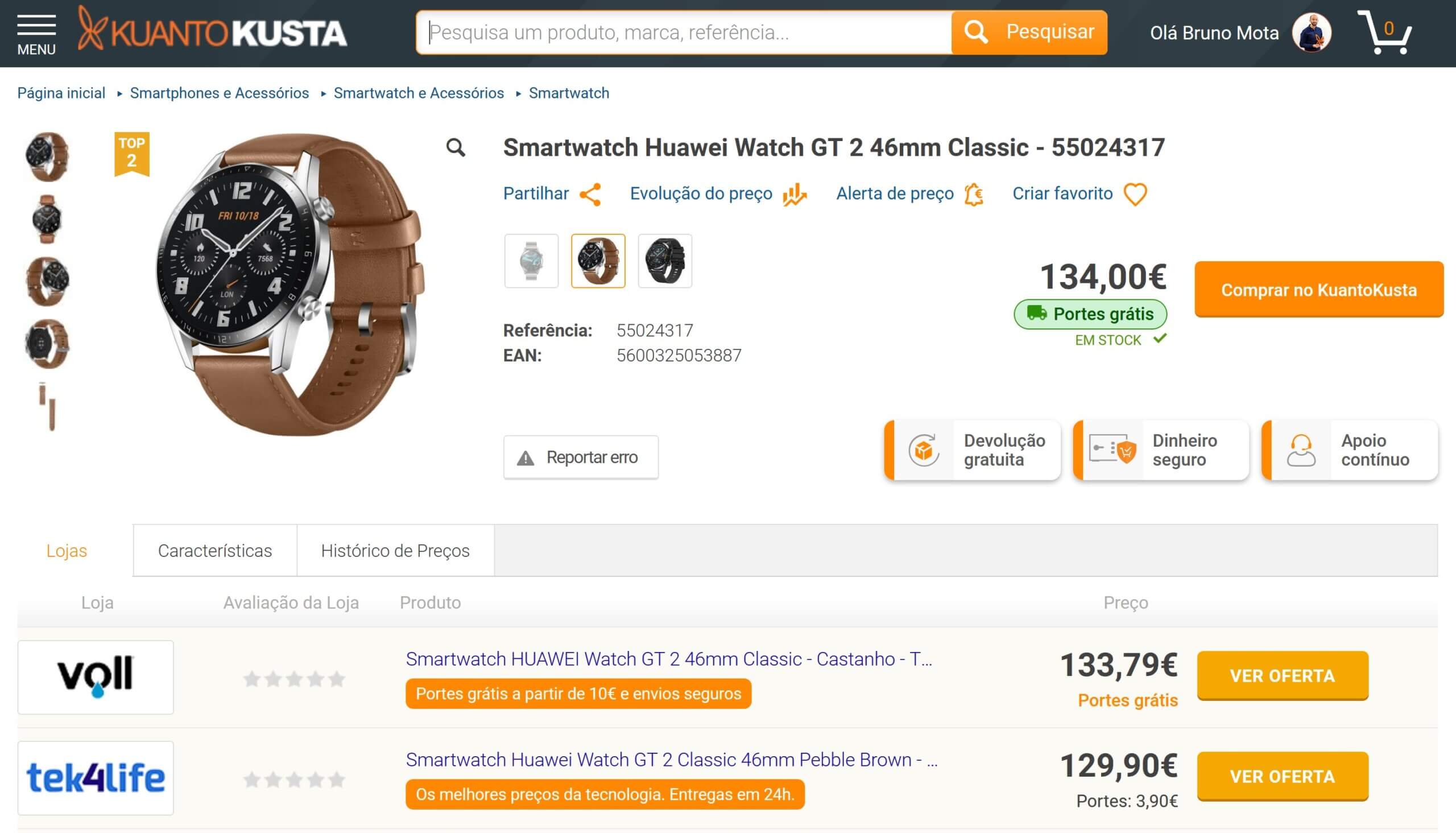
The label was to be featured in this “TopBox” or “BuyBox,” as it is called in most marketplaces.
Reframing the Challenge
Because we have to increase sales, it makes sense to place a store in the TopBox that sells products inside KuantoKusta.
Users most of the time gave a lot more attention to the top of a page, this is especially true on mobile, but it happens on desktop too. So it would help if you put essential things up there.
It’s called “above the fold.” The fold itself has a variable position because of the different screen sizes.
The name came from the newspapers, usually sold folded, so if you want the critical news or ads above the fold, bystanders and people passing by could see them.
So if we need to put a store that sells in the Marketplace in the Topbox, the challenge becomes: How much more is a person willing to pay for buying a product in the Marketplace instead of a store they don’t know they could trust*?
After all, it is our money, and we don’t want to lose it. We buy online if it’s trustworthy, and this mindset is especially true in Portuguese e-commerce.
So how much more are you willing to pay for stress-free shopping?
If you are buying a product that costs 20€ you probably won’t bother to pay an extra 2€ to secure the transition, that’s 10% more.
If you buy a product that costs 1000€, top-up 10% and you get 1100€, that doesn’t seem a great deal.
You want to place the store that sells the product in the TopBox only if it has a price that is still attractive even if there’s another store cheaper but not known from the user or the user doesn’t trust his money.
The challenge was now to build an algorithm that mimics the human perception of a price difference.
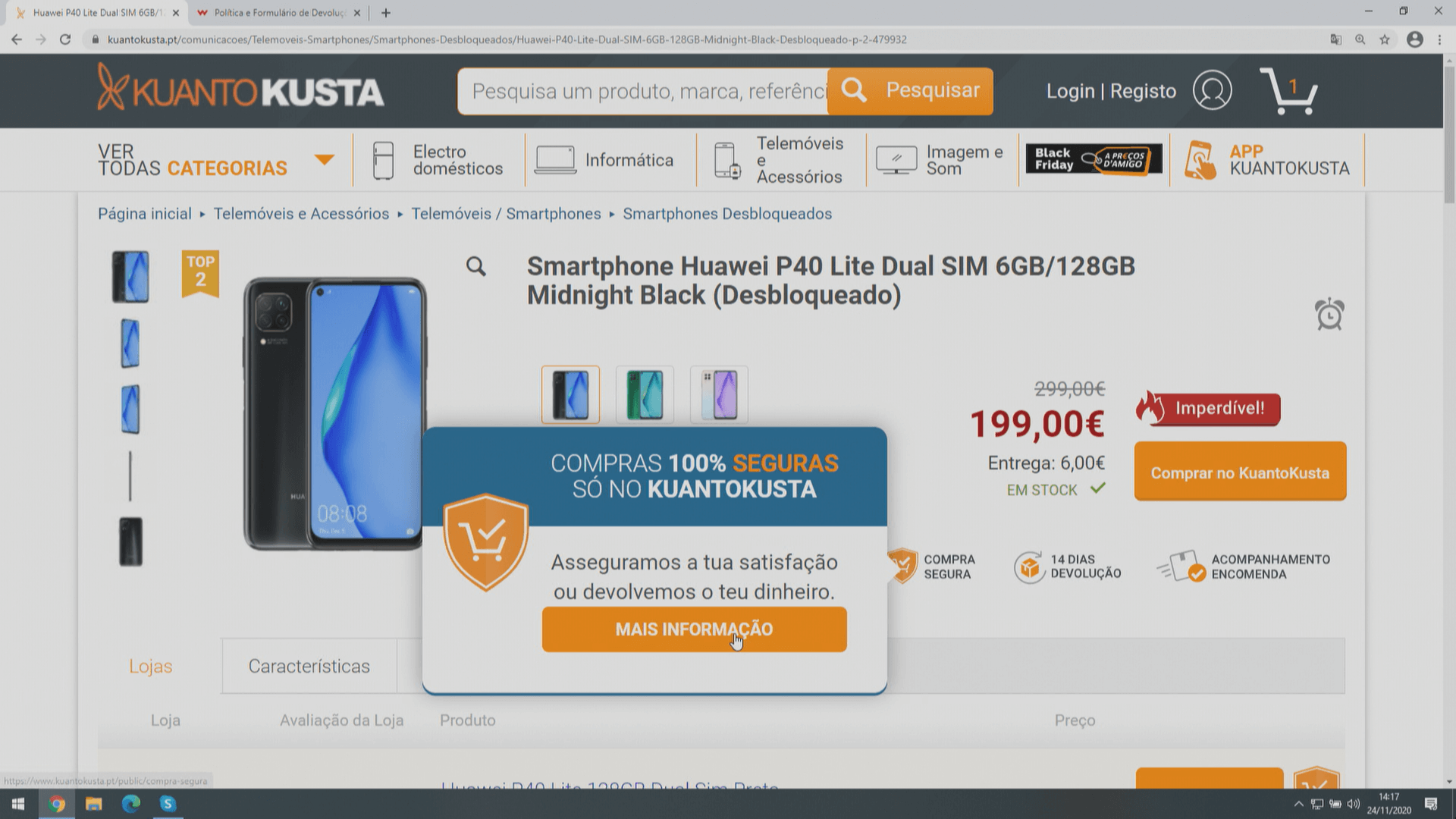
The second challenge was to tag the TopBox offer with a label that could help the user make a good deal. We came up with “Imperdível” (unmissable).
Shoot the cannons!
To mimic the human perception, I was thinking of: “the amount more I’m willing to pay for a product decreases as the price of the product increases,” meaning I’m willing to pay an extra 2,5€ if the product costs 10€. Still, I would only pay more 50€ or so if the product costs 1000€.
This immediately reminds me of physics and a cannonball trajectory!

It just made sense! The higher the price, the less you’ll pay extra in gross numbers. Of you go, I had the basis for building the first algorithm.
Now I need to address the one that was a lot more complicated.
Fibonacci to the rescue
While I was thinking about this problem, I was looking at the price history of a product.
The price history shows the minimum price over time and the medium price of all the stores.
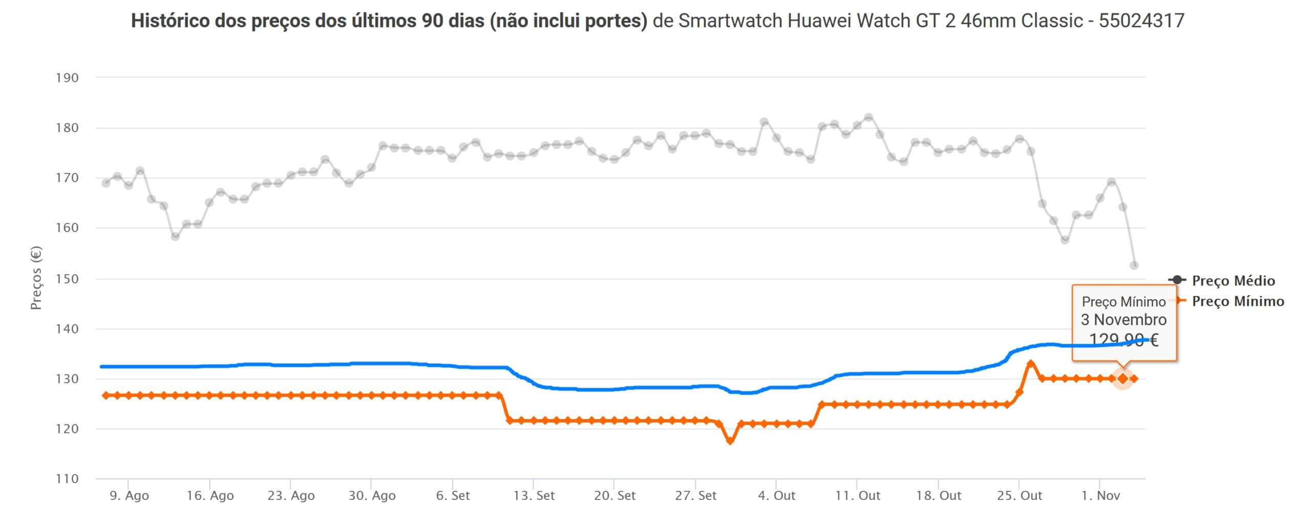
In orange, you can see the minimum price over time, and in grey, the average price of all the stores, and in blue, it’s an imaginary line that I thought most people wouldn’t mind paying extra to know their money is safe, and they would end up receiving their order, or they would get their money back.
As I was imaging it and knowing that this could not be a fixed percentage over the minimum price, I wondered if there was something nature-related that you could describe in a mathematical formula.
Then I imagine it like this:
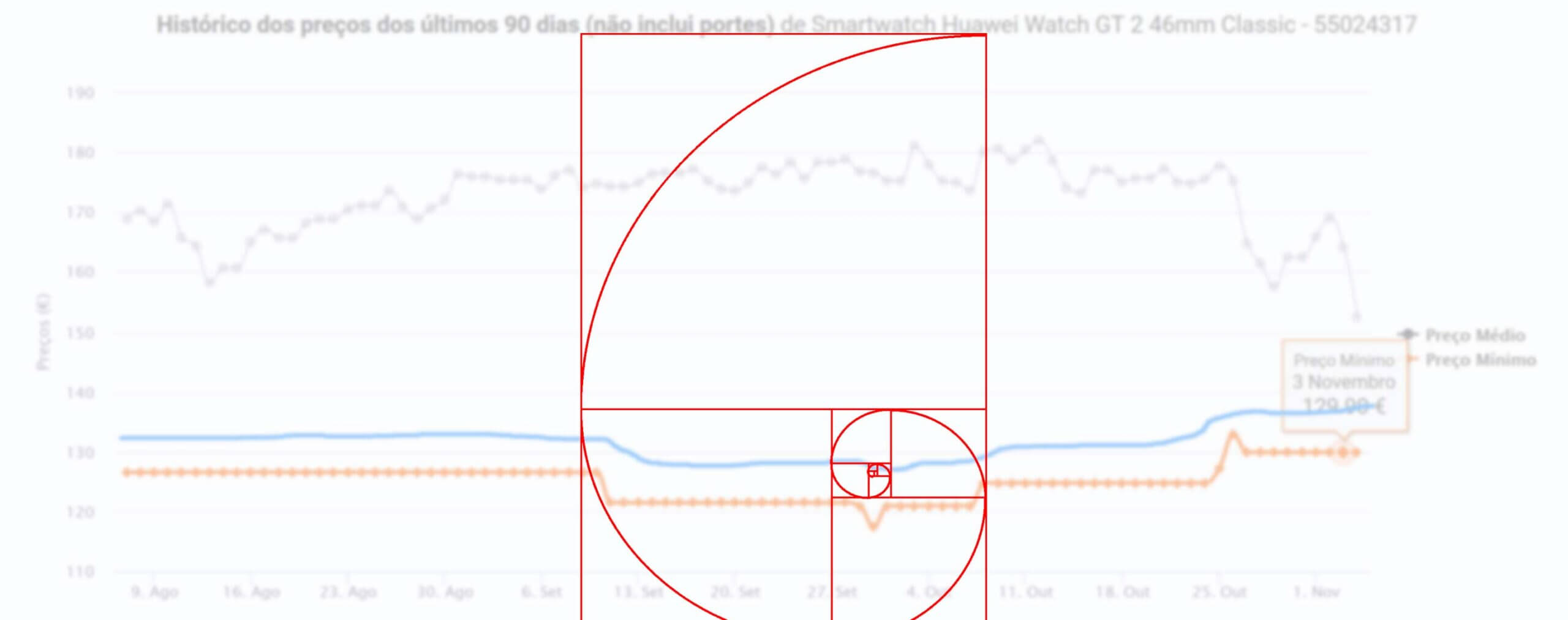
There it was. I could now see a relationship between numbers and something in perception and psychology!
The Fibonacci sequence has some exciting properties since it grows almost exponentially, it starts like this: 1, 1, 2, 3, 5, 8, 13, 21, 34, etc., and it has a close relationship with the golden ratio.
The minimum price would be zero here, a good bargain would be at most where the 3 is on the spiral, and beyond that, it probably was a smart deal until 5. Beyond that, the price is already too high.
This compares a given price and the lowest price for the same product.
The Fibonacci sequence seemed to be perfectly able to provide a solution since this sequence describes so many things in nature.
In this visualization and further testing, I realized I could have two labels instead of one: the one mentioned, unmissable, for products that were a little more expensive than the lowest price available and another tag “Smart deal” for prices that were not so good but they provide a good deal nevertheless if you need to buy that product now. It served as positive feedback for the user: “It is not a huge promotion, but you are buying it at a good price.”
Sales Skyrocketed!
Immediately after these labels went online, sales soared over 100%!
The labels were shown on product pages, category pages, and search results, and all the products have a special catalog page for promotions that you can find here (https://www.kuantokusta.pt/descontos)
The psychological effect is powerful and combined with the proper iconography and color, it worked beautifully.
External and independent feedback
These effects were so sound that KuantoKusta was featured in Contas Poupança from SIC, with an unsponsored and fact-checking program, that it boosted, even more, the sales and our Black Friday one month later.
They’ve made a press release describing it: https://contaspoupanca.pt/2020/11/26/video-black-friday-como-aproveitar-boas-promocoes-e-com-seguranca-nas-compras-online/
They’ve made a program to help consumers find good deals and was streamed on national television at prime time: https://sicnoticias.pt/programas/contaspoupanca/2020-11-25-Black-Friday—nao-seja-enganado-com-falsas-promocoes.
These labels have evolved into others that are more strict in terms of prices and ignore the kind of business model the store is (PPC or MarketPlace, it doesn’t matter). At the time of writing, they present the best deals of Black Friday 2021.
*This premise made marketplaces more appealing since the Marketplace is responsible for all the transactions, and the user won’t lose money in any situation.