I have designed the DentalPhoto app back in 2014 and it was meant to be developed both on Android and iOS.
The brief:
Create an app that would make it possible to have a dental diagnose before heading to the clinic. By following some photo tutorials you would then take pictures of your teeth and those pictures would be sent to the clinic for diagnosis. You could make an appointment via app calendar and be remembered. The app name should be one that could be easily understood both in Portuguese and English. I was given space to create freely the design, app architecture and user flow.
Has a first step I want to come up with a name that suited the brief and target audience, a name that was both simple and described well what that app was all about. The first name was Dental Xr Photo, the Xr was short for X-Ray, Dental is understood in both languages, and Photo is also easily understood.
Skeuomorphism was featured side by side with a flat design on those days.
The main goals when designing the app:
- Easy and intuitive
- Simplicity in the user interface
- Additional tools to the diagnostic main service
The app usability
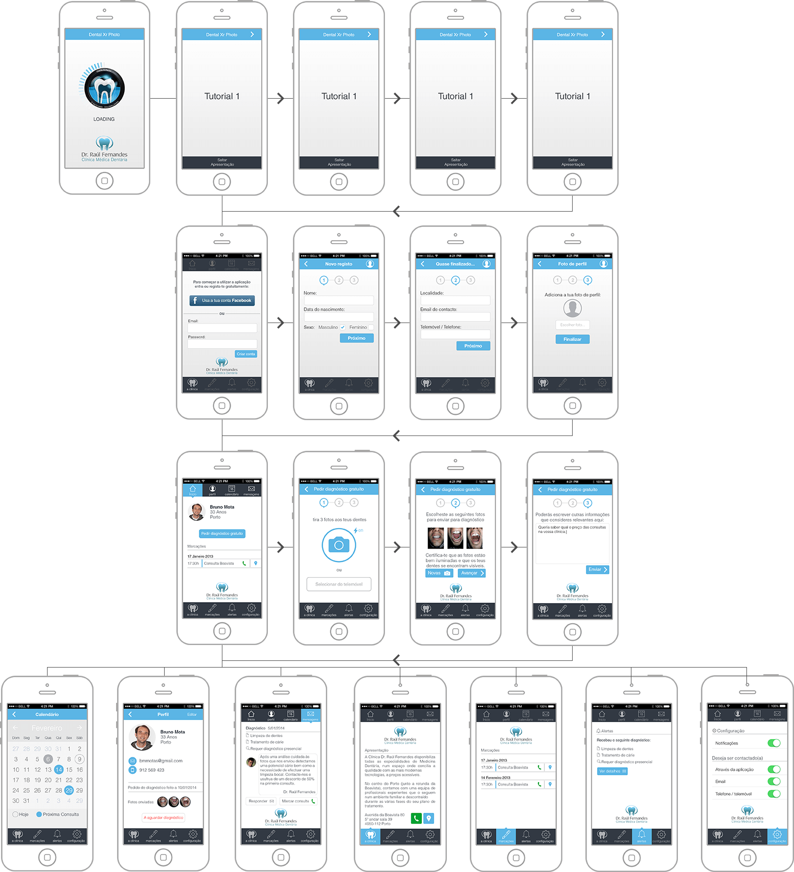
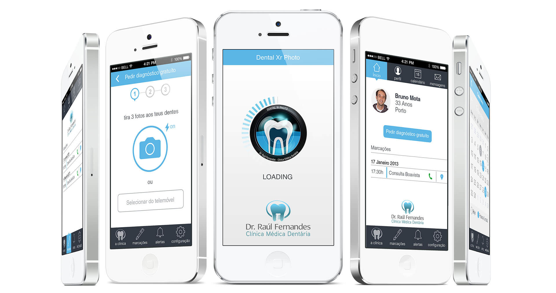
Using the app was easy, after the user open the app we would be presented with a short tutorial. Bear in mind that this app was from a Dental Clinic so the users wanted to know how they should be using it. The user could skip the tutorial altogether and jump to registration which was mandatory for keeping onlookers at the shore. In the registration, the user could use Facebook login or make registration using email.
After the signup, the user would be on the app’s main screen and could begin taking photos. On the navbar, there’s a link for an about page featuring the clinic’s information, contacts, localization, and a brief history. For the user to feel safe using the app and giving it credibility the clinic’s logo is well visible on this screen.
All the tools available from the home screen
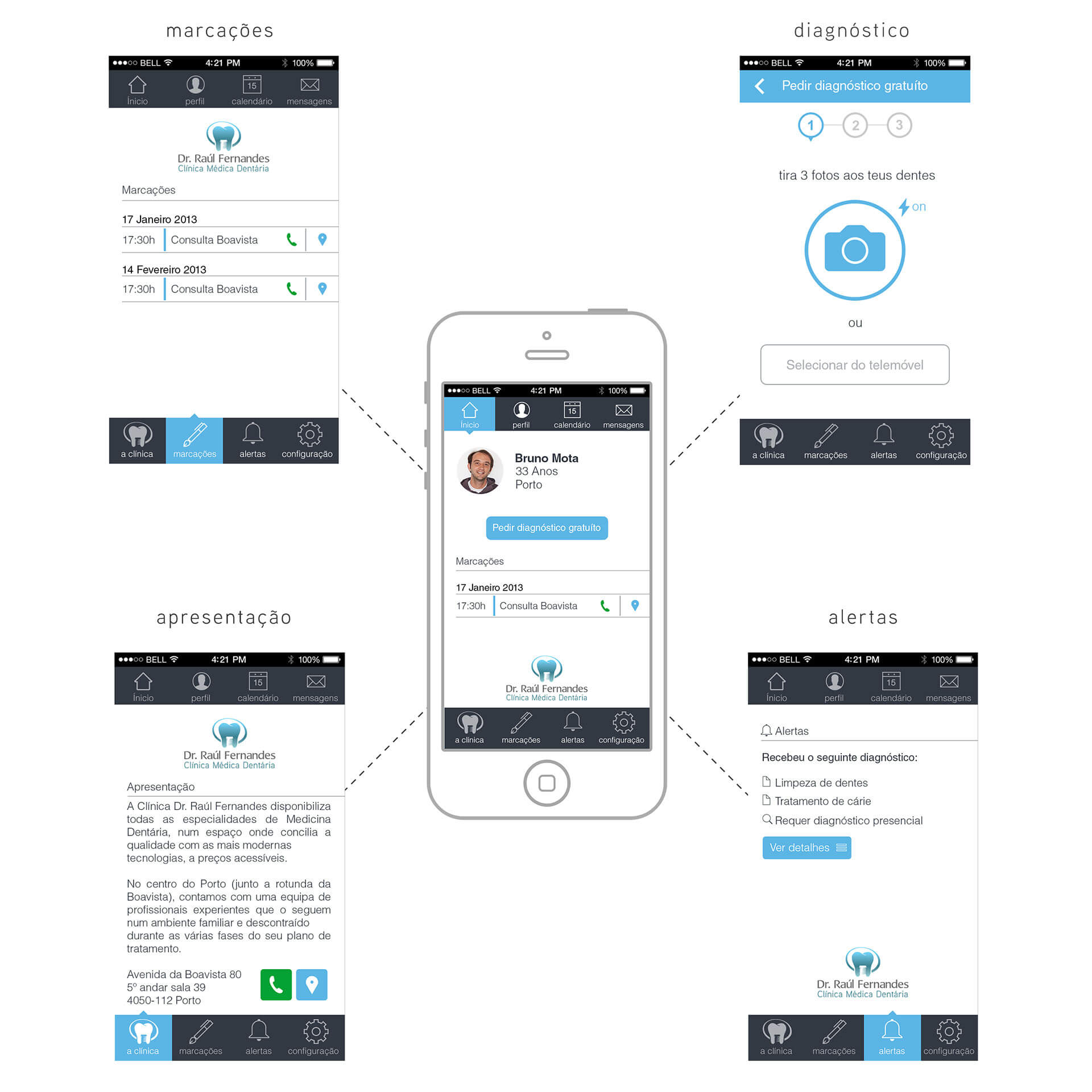
From the main screen, the user could access all the resources of the app, like asking for a free diagnosis, reading additional information about the clinic, making appointments, getting system notifications about a new diagnosis or appointments.
Here I wanted to maximize and simplify the access to all the information, so either an advanced or inexperient user could use it. All the processes were simplified in order to be intuitive and don’t rely much on tutorials.
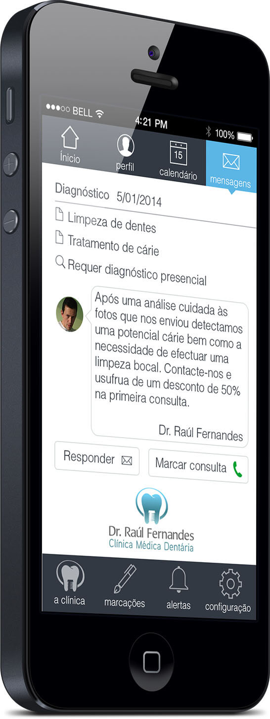
The diagnosis message is also a direct one, i.e., it is presented with easy-to-read topics that could be pre-defined in an admin back office. A personal message could be added in order to make an appointment, offering a discount for first-time clients for instance.
In this message area, the user could reply to the message by text, asking for more information if needed or he can call the clinic by phone.
User journey