
KuantoKusta is one of the leading e-commerce websites in Portugal. Starting as a price comparison site, it evolved into a marketplace in late 2018. To make the marketplace work, we need to create from scratch a shopping cart and a checkout process that should provide a great and seamless user experience. This is the process that I and designer Joana Castro made to make it work.
First things first: Empathise
We need to learn about checkout processes, best practices, and requirements to develop the best possible understanding of the users, their needs, and the problems that underlie the development of that particular product.
- We did a competitor and similar e-commerce websites analysis benchmark
- We’ve analyzed best practices and guidelines from leading user experience companies like Baymard Institute and Nielsen Norman.
- Web analytics data is available to study our user’s current behavior
Defining the problem
We analyze the observations and synthesize them to define the core problems that we’ve identified. We’ve tried to define the problem as a problem statement in a human-centered manner.
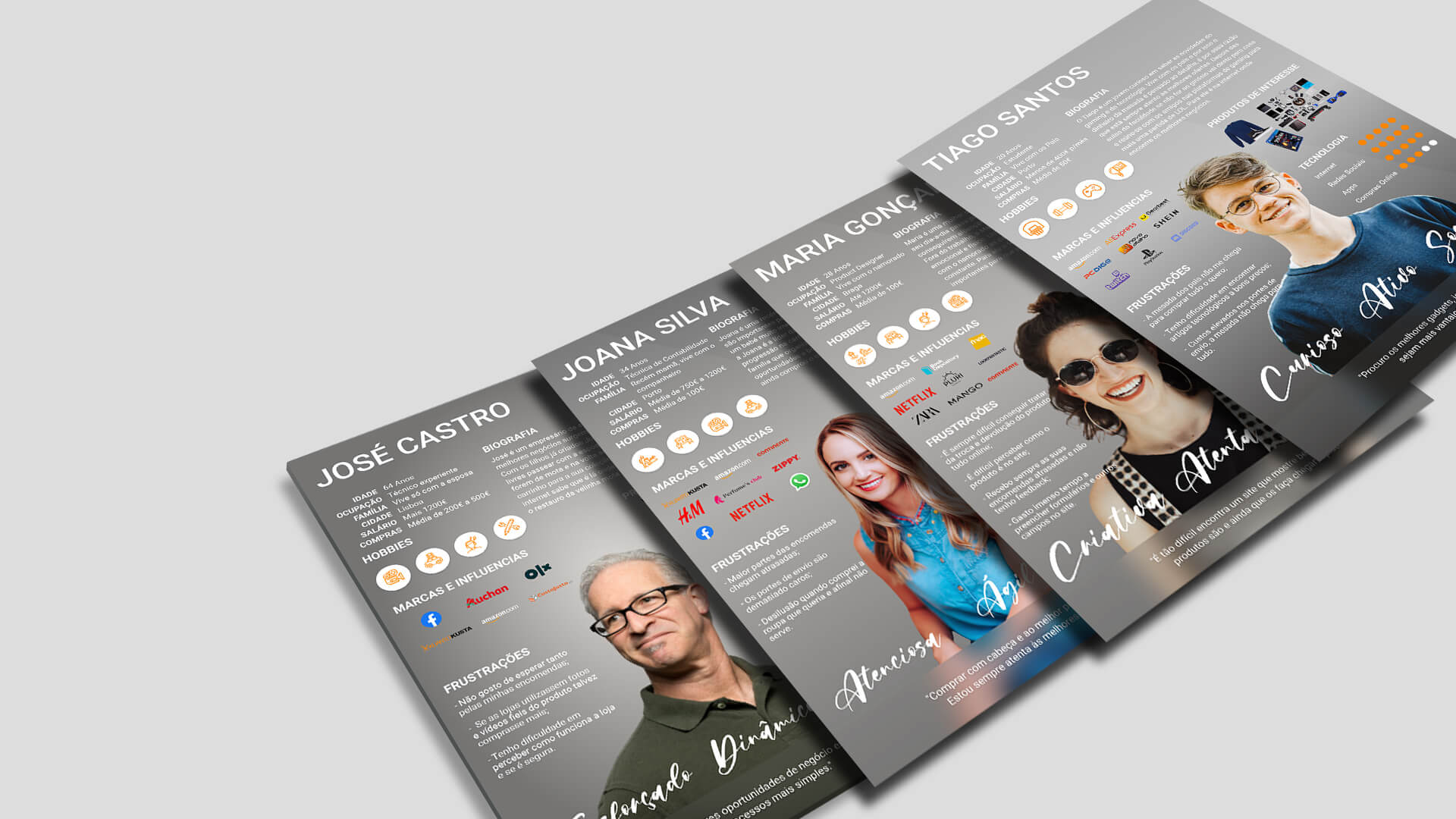
Using the personas helped us find solutions that meet their needs and address their pain points.
Defining the correct problems helped the designer in the team gather great ideas to establish features, functions, and any other elements that would allow them to solve the right problems. In this stage, we started to progress to the third stage, Ideate, by asking questions that help us look for ideas for solutions by asking: “How might we…”
Ideate on the problems we have defined
With the information we gathered in the first stage and a deeper understanding of the issues a user may face, we’ve created some “How might we” questions that will serve as a lighthouse for the brainstorming sessions and future prototypes:
- How might we show the customers all the information they need in the shopping cart without overwhelming them?
- How might we create a checkout process that is easy and accessible?
- How might we improve the mobile checkout process?
- How might we communicate a safe shopping experience during the whole process?
- How might we show the user that he is buying from different sellers?
- How might we inform the user of the estimated delivery times without losing customers?
- How might we have a very straightforward way to select payment methods?
- How might we deliver an order resume with all the important information the user needs?
- How might we improve the abandoned shopping carts rate?
- How might we facilitate and speed up a new buy from a returning customer?
I facilitated the brainstorming sessions while working as a UX/UI expert reviewer. We’ve challenged assumptions by testing various prototypes in different stages of the prototype process. From these sessions, we came up with an MVP and a better definition of what the final product may have regarding additional features.
I’ve created the journey mapping for the user, the order, and its different stages. That allowed us to focus on delivering the best UI in each process stage without forgetting any crucial step.
Prototypes
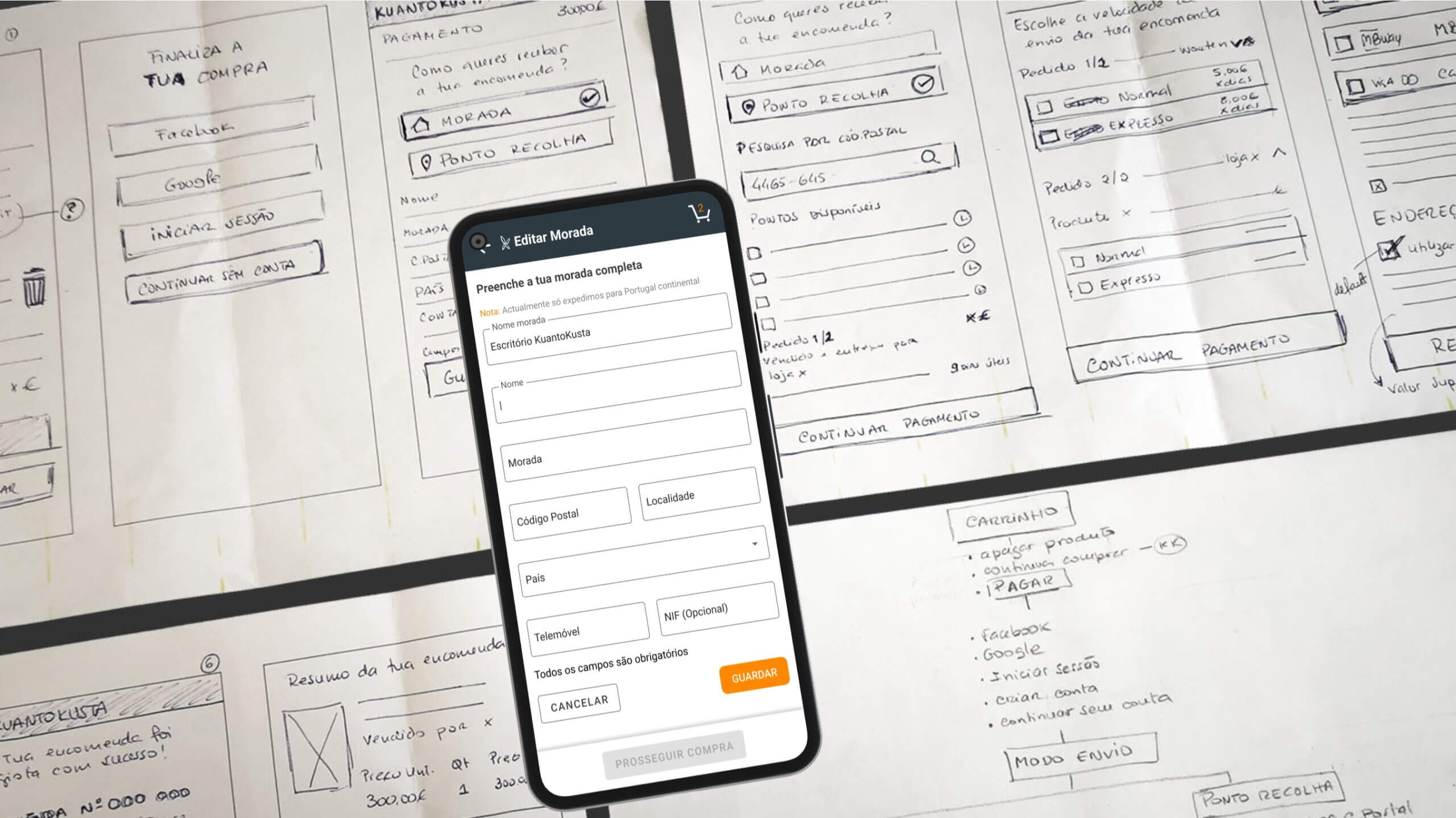
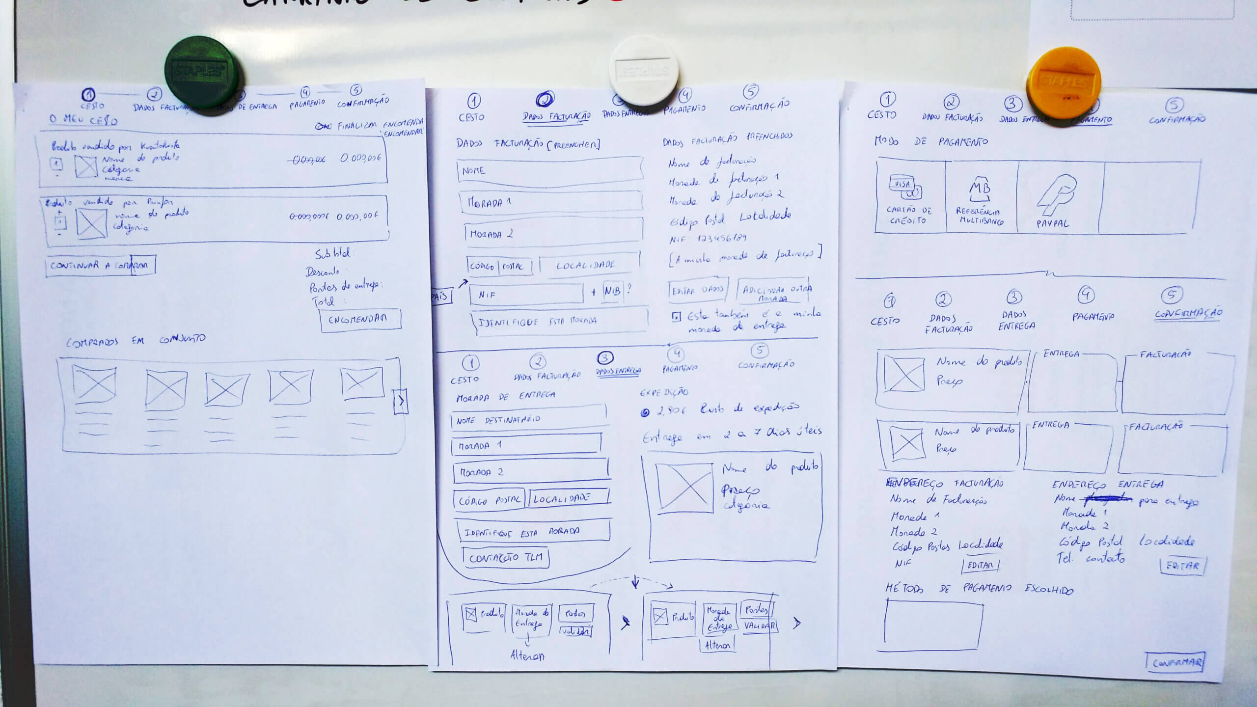
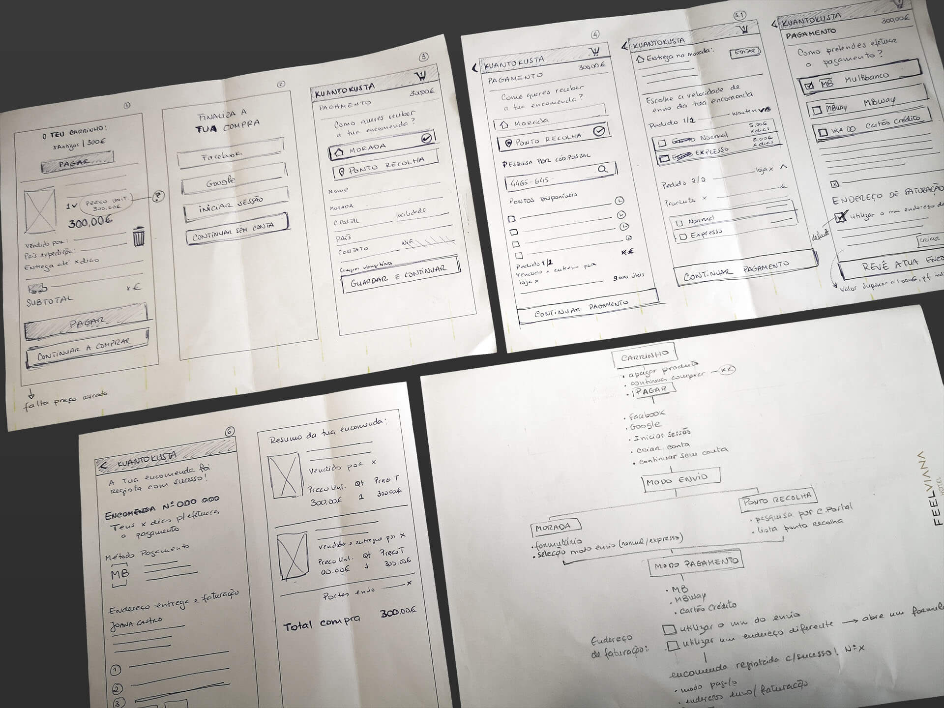
Initially, we made some sketches and wrote down our ideas on paper and possible solutions for answering the questions razed in the previous stage. It’s an inexpensive, scaled-down version of the product or specific features found within the product. These prototypes were shared and tested within the team, in other departments, and a small group outside the design team. This experimental phase aimed to identify the best possible solution for each of the problems identified during the first three stages.
The solutions we tested within the prototypes were investigated and either accepted, improved, and re-examined or rejected based on the users’ experiences. In the end, we have a better idea of the constraints inherent to the product and the present problems and a clearer view of how real users would behave, think, and feel when interacting with the end product.
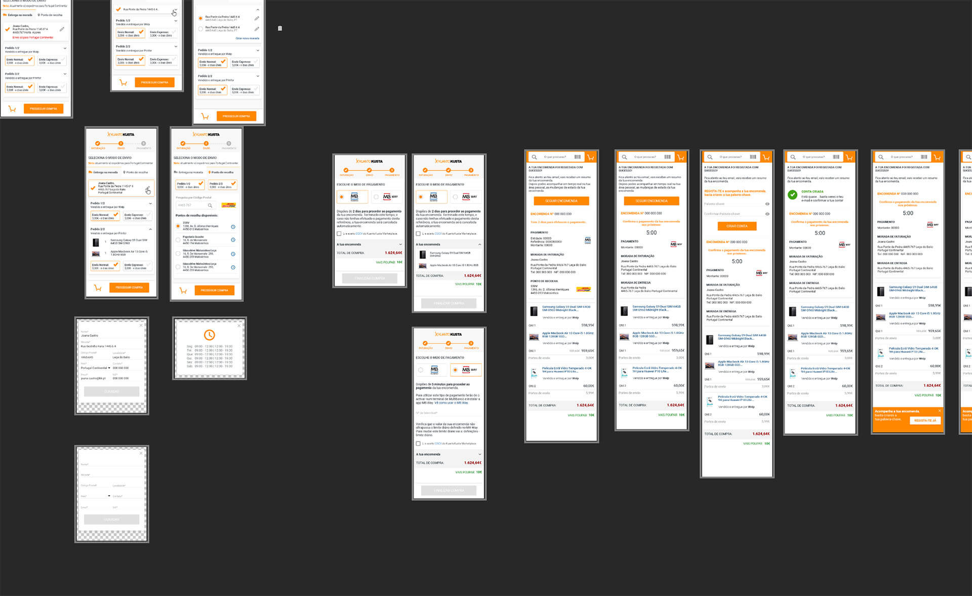
We’ve produced high-fidelity prototypes using Photoshop and Invision (or core work was done using Photoshop until 2018, when we migrated to Adobe XD for high-fidelity prototypes and then Figma and Zeplin). We’ve created the interactive mockup for desktop and mobile using Invision.
An overview of the high-fidelity prototype made in photoshop:
As most UI and UX designers found out, Photoshop is far from a good tool for this work. So we’ve switched to Figma, using components and all the versatility and speed it provided. The apps followed and have ascetics and navigation according to the guidelines provided in Apple Human Interface Guidelines and Google Material Design.
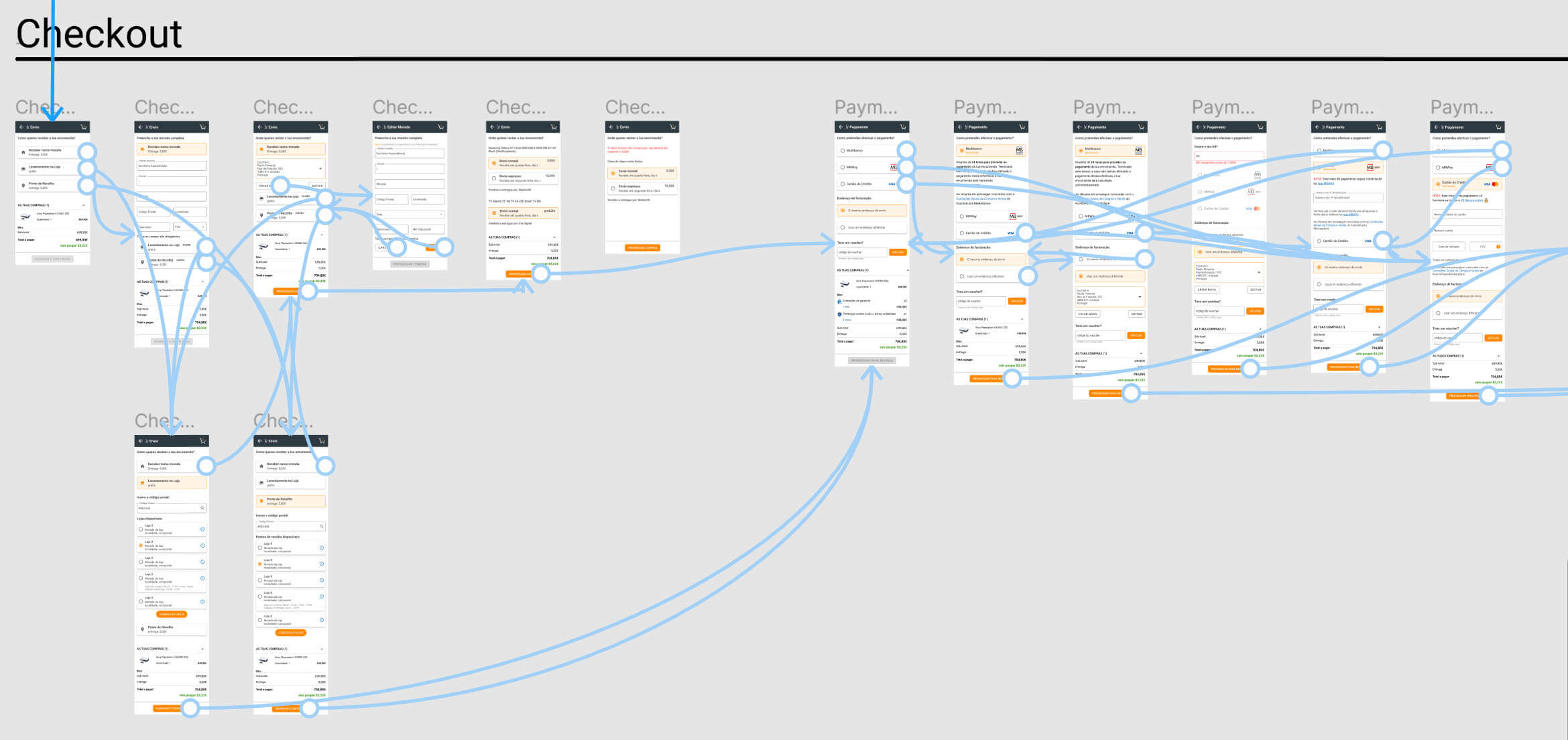
We were a team of 2 making this checkout. I evaluated all the designs in all devices and screen resolutions, ensuring they worked especially on mobile. I’ve presented the decisions and designs we’ve made to all administrators to have their buy-in. When we switched to Figma, I built and designed the style guide, part of the design system, and components.
All the project was done in a modular way. So if you want to add or remove functionalities that were not core, it wouldn’t affect the overall experience.
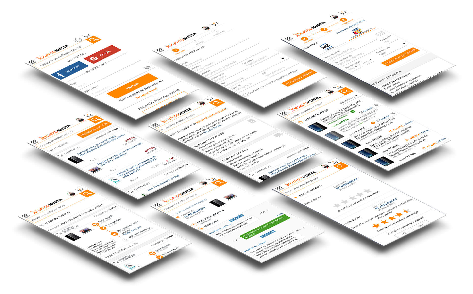
One of the main challenges was concerning payment methods, especially the credit card since it had to use a 3D secure process, and not every customer had that active in their bank account, resulting in a failed payment. The other issue was with MB Way, another payment method with a max limit of value for purchases, which required the user to have the service and validate the payment in an app. The logo is also very similar to Multibanco, and that caused some confusion for some users. We’ve tested some solutions, placing additional information and swapping payment positions.
It was all made in an agile way, we work as close as possible with the development team and engineers so we can be sure that whatever we’ve made was technically feasible. It also allows us to make a smooth transition in the handover, saving a lot of time in creating a long list of requirements. During the development phase, that collaborative way of work continued as we made minor adjustments in some elements of the UI to enhance the experience.
The Take-Away
We launched the first version of the checkout and shopping cart when we launched the marketplace. We had about 3 months of work while doing other stuff as well. We then iterate on that, analyze the data, conduct some usability tests, and learn from our mistakes. We then designed the second version of the shopping cart and checkout, optimizing for efficiency. This is never a closed project since there are always upgrades to be made and steps we can improve.
The work was not always sequential since we also needed to design other parts of the site. When we got a solid working version that converted well, we focused on improving the mobile experience as much as possible. Traditionally users don’t use their phones to make purchases, we want to change that. The pandemic helped us with a little push in the right direction since we’ve had massive growth in online shopping, particularly during the lockdown periods. Because we’ve delivered a solid and pleasant experience, the numbers continued to rise even when the lockdown was over.